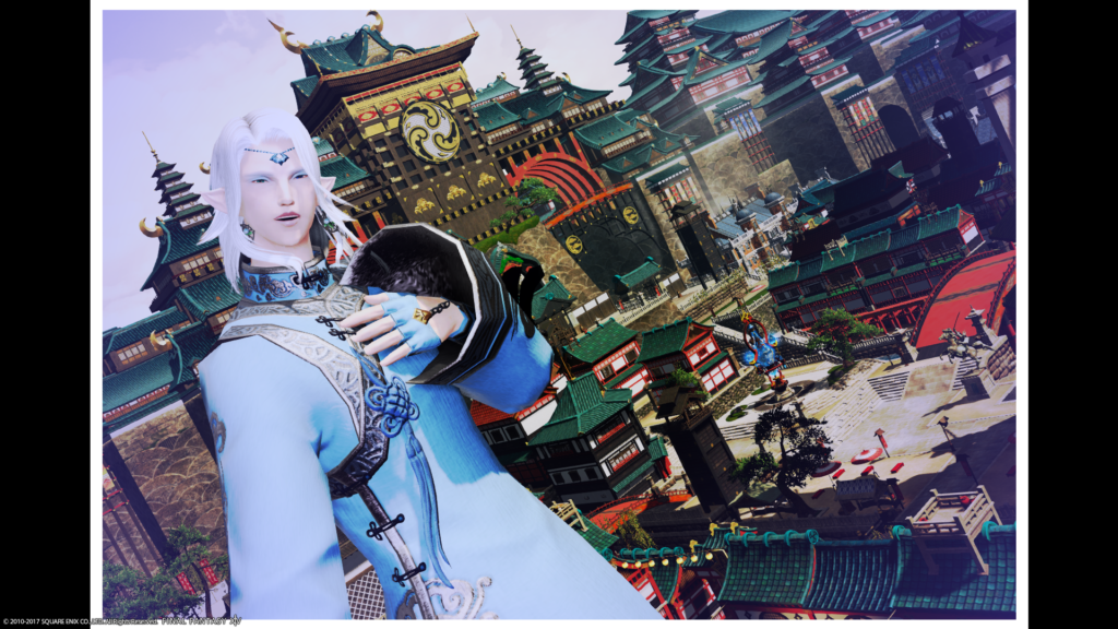
Round 2 Theme: Kugane City Post Cards
Winner: Zetsumei Tsunarashi
Critiques
Rongi:
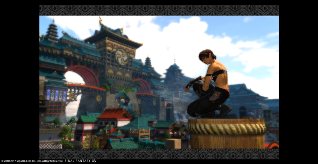
Nicol Grunenberg: Hey Nicol! Welcome to the competition! I loved how in your Audition you used your sword to lengthen your body and create a focal point for your images but I felt like your Minion shot was repeating that, and so it fell flat for me last week. This week on the other hand, you stepped it up! I love the crunched-up pose with you looking over your shoulder. I find the background a little too “obvious” though for a Kugane shot. Titling the camera a little bit could have really helped make this more unique. I love your pose, but I do wish you had centered yourself on that post, instead of being off to one side. I think this is a strong image though! I like it a lot. My personal challenge for you is going to be to work on making your backgrounds unique and special in some way, as while this week is better than Minion week, I want to see something like in your Audition shot! That scenic shot was amazing! Good luck in the competition!
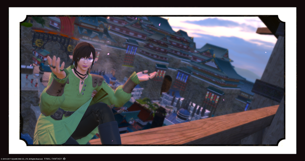
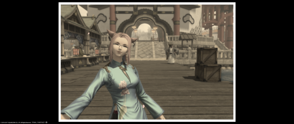
M’telihgo Feilyon: M’telihgo! Welcome to the competition! Your Audition battle shot was really great, and I hope to see more shots like that from you. But let’s talk about your backgrounds and your framing (framing = set up of the shot, not the use of frames). In your audition scenic shot, your background is very dark, and while there is a statue in the background it isn’t positioned in any particular way. It’s just there. Moving to your Week 1 Minion Shot, it’s the same. I like what you are doing with your Minion, but the background is just there, and with a big hole in the center as well. Now we come to Week 2, and again your background is just there. I love that you made it look like a selfie, and that it’s in sepia to stress the fact that you are “remembering the time” you got lost. But I wish the background had been more exciting. Looking at all the other shots this week, we see a lot of the say places…so I commend you on doing something different. But Zetsumei did something different as well, and her background is quite impressive. My personal challenge for you going into next week’s round is to look at your backgrounds and how they affect your image. Good luck!
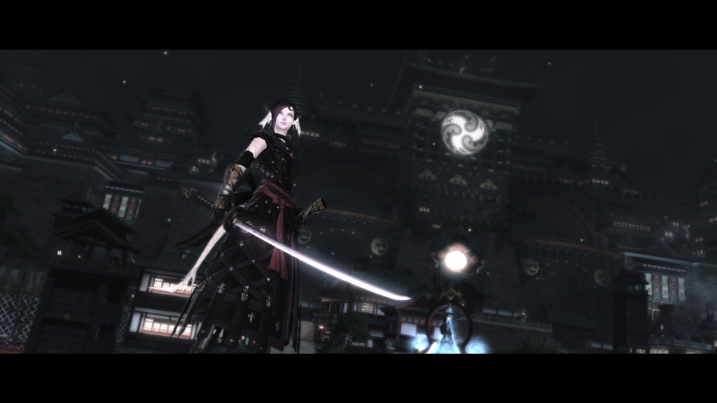
Amelia Amber: Amelia! Welcome to Eorzea’s Next Top Model. I loved both your Audition Shots very much, so I was quite happy to see you get cast this cycle. Your Minion shot was beautiful and in my Top 3 last week. While the background wasn’t necessarily framed in an obvious way, the colors all matched up beautifully to create a solid image. This week is again, very impressive. And I love everything about it. I love the filter you chose, and the pose and the glamour. Everything is absolutely great. You are in my top 3 again this week, but you may wonder why you aren’t number 1…and the reason is because I do not get “lost in Kugane” or “Post card” from this at all, like the Round said. You are giving me “Movie Scene.” I absolutely love this image, I think it’s very powerful. My personal challenge to you is to make sure you match the round description as best you can. In this images case, maybe a different frame would have made this less Movie and more Post Card. Believe me when I say I cannot wait to see what you bring to the competition next week. Your images continue to blow me away!
Zetsumei Tsunarashi: Welcome to the Competition, Zetsumei! Your audition shot was very unique, using Portrait mode for your Scenic, and then having a Close Up for the Battle Shot. I was disappointed that your Minion shot was also a close up though, and thought your pose looked really uncomfortable. Is that your left or right hand?! Haha. This week, you continue to be unique and it turned out wonderfully. I love that you went for a different area than everyone else did and I love that you used a colored/design frame. This is my favorite shot of the week. I love that you are doing the /lookout pose while /winking because it gives off a very Japan-I mean Kuganese pose. I love the depth we’re getting from the diagonal background, and I think your glamour is very “blending with the locals.” This is a post card shot if I ever saw one. I do wish you had been more to the right of the image though instead of slightly off center. That would have made the image perfect in my opinion. My personal challenge for you is to continue being unique with your shots, but remember that uniqueness should come second to overall composition and framing of your shots. Be crazy, but controlled crazy. If that makes sense. Good luck!!!
Katarh:
Nicol Grunenberg: The kneeling with the head turned coyly to the camera is super cute – great pose! Kugane Castle in the background looks lovely, and the slope of the background compared to your character makes a nice contrast, especially with your head peeking into the sky. The ornamental border brings home the postcard feel. This image might have benefited from a little bit of camera tilt (a rare thing coming from me, the anti-angle person half the time), if only to drive home the candid nature of the shot. Good choice of glam for a “tourist ninja” as well.
M’telihgo Feilyon: I like the use of the Echo combined with the picture frame to have an “old timey” feel to this – and the selfie arm is a nice touch! The location makes you look like a fresh tourist in Kugane for the first time, which matches the theme. The pastel of your outfit is a good contrast to the wood tones of the dock and the hostelry. That said, it’s one of the less vibrant locations in the city, and the only object on your right side are some boxes – which while nicely aligned, are not quite the most interesting thing to snap a photo of compared to the stalls on the left. Otherwise it’s a great setup and composition.
Amelia Amber: Final battle time! The cinema frame combined with your color scheme and the choice of a night shot almost gives this a Matrix-like feel. That’s great if that is the mood you were going for… but I feel this is neither touristy nor postcardey. (I’m not sure I want to visit Kugane if there’s fighting going on!) Composition-wise, it’s a good set up and although your dress is dark against a dark background, it makes your katana pop out even more. Great use of the angle tilt.
Zetsumei Tsunarashi: I’m hungry now, thanks… This is such a colorful and playful shot, it’s among my favorites this week. The feisty tourist chef going hunting for rare ingredients in the shopping district – but stopping to take a snapshot with the camera, too. The tilted angle is perfect, and the outfit choice lets you blend in but pop out at the same time. The selection of the ornamental border lets the reds and golds in the background pop out, too.
Nads/Vaughn did: Samuru Lantis, Destiney Delvanguard, Gangly Zilla, Leviathan Seagreen and Linmei Quan
Nadede:
Samuru Lantis: Samuru this is a very nice shot that was taken. The glamour looks really nice and the color goes well against your character model. While I do like the color filter you had used, I am not too sure about the lighter limb darkening that you had used. It makes you appear a little washed out in the face along with the color of the sky. With some shots, the lighter limb darkening works while in others a darker one would be a better choice as it is typically used to help draw a viewer’s attention to what you want them to see. Play around with that and the different color filters as the outcome might surprise you 🙂 . Overall good job this week and look forward to seeing what you come up with the next week 🙂
Destiney Delvanguard: Destiny, isn’t it lovely when one gets lost somewhere? You never know what you will come across, good or gulp bad. Your glamour makes it feel as if you are not from the area and visiting Kugane for the first time and thus the reason why you got lost? Hmmm. There are just a few minor things that is throwing me off about your shot this week. The first thing that is throwing me off is how you are sitting on the beam. It looks as if your tush isn’t fully on the beam and you could fall off any second. The second minor thing is your facial expression, I feel, does not match your hand gesture or your description. I am wondering to myself “What is she winking at exactly?” Try playing around with the different expressions to go with your gestures, along with body placement, to help convey your story or make your shot more believable to the audience 🙂 . I do have to say that I like this one a lot more than your shot from last week. I couldn’t really make you out last week as everything was close to same color tone and no use of lighting to help bring you and your puppy to the foreground. Keep improving and can’t wait to see how you do next week 🙂
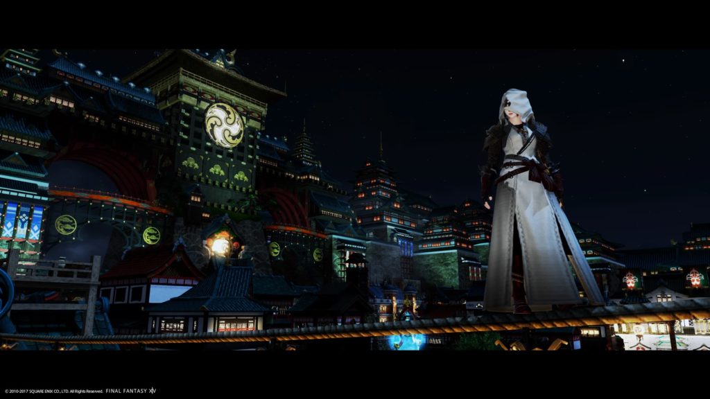
Gangly Zilla: Gangly I absolutely LOVE this shot. One of my favorites this week. Love me some Assassin’s Creed 🙂 I really do some of the contrasts that is going on here between your glamour and the background along with the bounce of the lights off of your glamour and other objects in the shot. Another thing that I like about your shot is that there are some elements that helps guide my eyes around the entire image and comes back to you. An example would be the direction your head is facing, which leads my eyes to the background and how the rope that you are standing on is lit that brings me back to where you are at.. I am also liking how the lighting in the sky goes from light to dark where the city skyline meets the night sky, almost close to what you would see outside the game. Very nicely done and looking forward to how you handle next week’s shot 😀
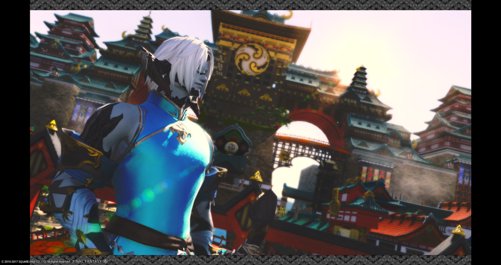
Leviathan Seagreen: Leviathan, this is another shot that I had liked this week. The color of your glamour plays well with the tone of your skin and scales 🙂 The angle of your shot works well and there is a softness to it that I am liking. It has a feel of you’re at ease and really taking everything around you in. I am also liking the natural effect of lens flare that you have going on. Along with how your body is facing, the flare helps lead the eye to the background and back again to you. Your image last week was one of my favorites and had loved the lighting in it that helped make such a dramatic shot. Keep up the good work and really can’t wait to see what you come up next 😀
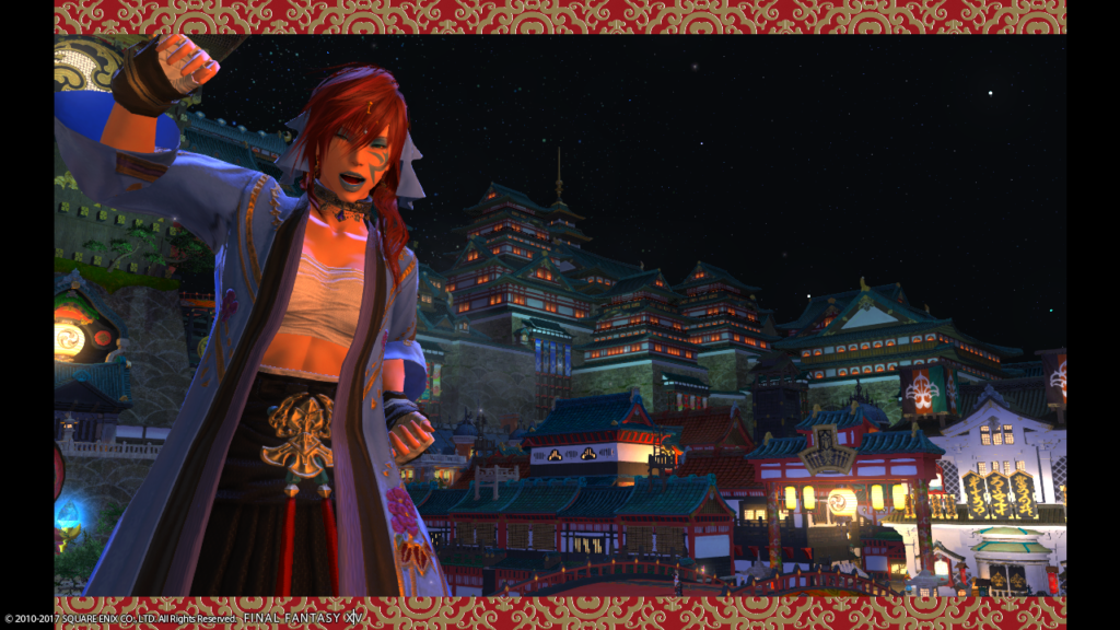
Linmei Quan: Linmei this shot is a vast improvement compared to last week’s shot! It appears as if you are getting ready to head to a boxing ring for a match. Don’t worry, I’ll place my bet on you winning. While I like the overall shot itself, I do find myself wondering about why you picked the border that you did. I am wondering if a much simpler border would have been better for your shot or not. A very minor thing that is throwing me off just a little is the strand of particle effect in your hair that is going in another direction than your bangs. Sometimes something so small can be a detraction for some in the audience. I know that your hair and make-up is a signature look for your character but I would like see you play around with something softer to see if there is a possibility of another story to seen in your shot or to give your shot a softer look all around. Keep up the work and looking forward to see what you come up with for the next challenge 🙂
Vaughn:
Samuru Lantis – “Oh! What a surprise!” as you pose for the shot. Snarky and cute! You do take beautiful shots, and you have a great sense of composition, but there’s something about the choice of model location that makes you look…headless. With such a pale complexion, being set against an equally pale sky does you no favors. I know you will blow us away next week!
Destiney Delvanguard – Much improvement from last week! Looks more like a complete image, lovely background, dynamic sky, and a cute lost little Elezen. At least you’re looking like you’re going with the flow! The only issue is the choice of filter making everything look a little more blurry than I think you intended. But I look forward to more of your work!
Gangly Zilla – I really like this shot. Dark, but the model stands out, and the overall lighting is very eerie. The overall look actually makes me think of another assassin game rather than vacationing in Kugane, but I can’t help but enjoy it!
Leviathan Seagreen – This showcases the city very nicely with the different levels of the buildings making it up, but I feel that looking at the camera would have enhanced your shot greatly. Perhaps a different color top, but I can understand not wanting to blend into all the red and gold. Still, Levi always looks best smiling!
Linmei Quan – Cute and festive! The city is alight, yet still makes a perfect backdrop to your illuminated figure. Welcome to Kugane! Let’s party!
