Round 5 Theme: Cosplay
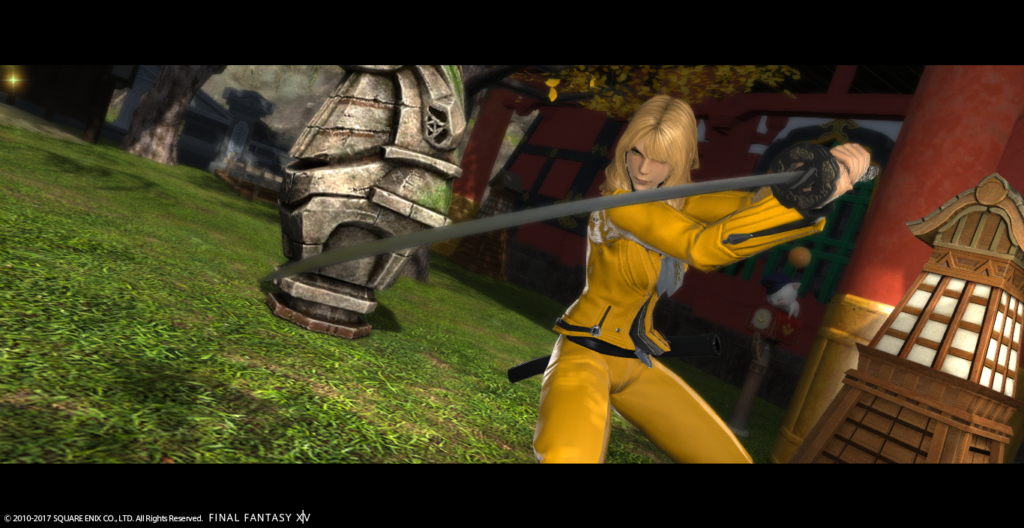
Winner: Samuru Lantis
Critiques
Rongi:
Gangly – We’re almost finished! You’ve been killing it this Cycle and last week’s shot was no different! I loved the tilt, I loved the outfit, I loved the location. I know that most people would use that area at night, and with a dark filter, so it was interesting to see it being used with a lighter filter. Moving on to this week’s shot, the only two things I can say is 1) I wish you had used the Kingdom Hearts reference picture instead, because I see a red jacket in the reference shot, but not one on you. In YouTube Cycle 2, Iris didn’t match her reference picture and it got her eliminated. And 2) her bracelets are gold!!! Haha. But other than that, I love it. Before even seeing the reference shot, I immediately knew it was Aeris. I love the white glow along the outside of the shot, and the flowers are perfect. I’d love to see a wholes series of these shots, with you looking in different directions, different poses, etc. So please post your other shots as well in the discord! Good job this week! I have no advice for you other than to keep it up. You’re doing everything right. See you in the finale!!!
Nicol – You are killing it! Last week you won, congratulations! This week I think you have a high chance at winning again. I immediately knew who you were and I let out an audible OOO when I saw it. Just to make a strong shot even stronger, I wish you had a few people in the back; wearing suits, haha. The shots great. Love the outfit. You look nice blonde as well. Haha. Going into the Finale, I wish you all the luck in the world and I hope you can find a background that will work perfectly with whatever pose and glamour you decide to do. Good luck!!
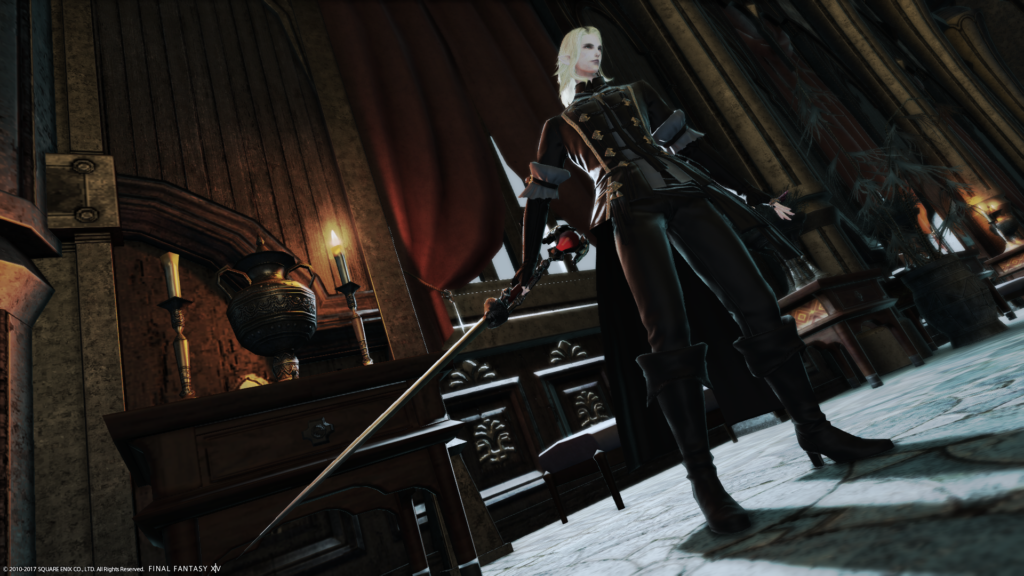
Samuru – Welcome back Samuru! I appreciated the location you chose last week, but unfortunately couldn’t understand the concept you were trying to convey. For the finale, I hope you can match your subtitle with your glamour and background. If you say you are reflecting, choose an ethereal or relaxing place, not somewhere washed out with sunlight, you know? Even the pose, while you are at least off center, is just you standing there looking off screen. This week’s cosplay shot, on the other hand, is PERFECT. I have no idea who that character is, but I LOVE the pose. I love the outfit. I love the long deep hallway and the tilt. I love the shadow at your feet. The candle, the plant. All of it. This is your strongest shot to date and one of the strongest this week. Next week I want you to take all of this, the tilt, the awesome glamour, the powerful pose, the dynamic background, and submit one last grand shot for the finale! Good luck!!!!
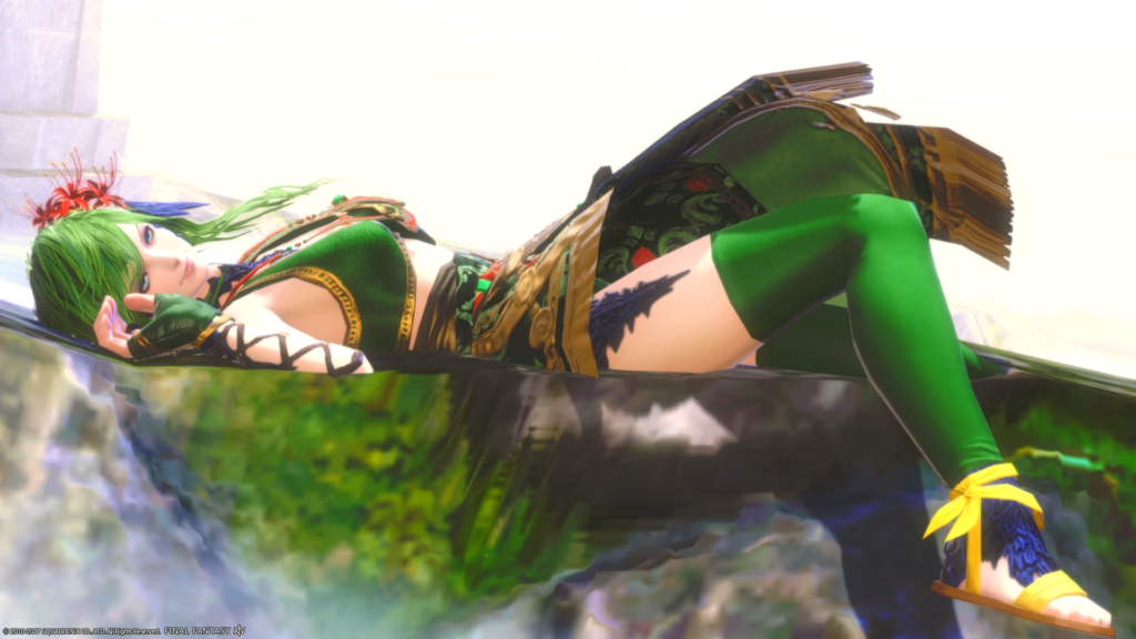
Zetsumei – Welcome back Zetsumei! This shot was extremely interesting. I will say that I wish you hadn’t used a cosplay shot for your reference image, but I understand that you did it to show that the cosplayer’s pose was also your inspiration. I love the pose and the glamour. I like the white behind you because it makes us solely focus on you too! I don’t know how much control you have in your face when you lay down like this, but if possible, I think it would have looked even better had you been looking at the camera sexily instead of over my right shoulder. But this is an awesome image. Very strong and unique. You’ve killed it these past couple of weeks and so I have no advice for you before going into the finale accept to continue to ROCK it!!! I have high hopes for you!
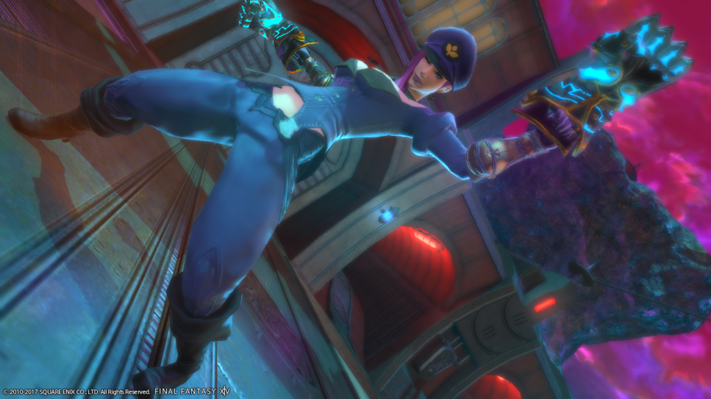
Linmei – The makeup is gone this week and has been replaced with your strongest shot to date! Great job. Last week’s shot was great, background and framing wise. The pose is alright, but the glamour is too dark and you blend right in with the amazing background. I wonder if something white or silver would have worked better (to counter balance the white gates in the upper left). This week was also amazing background and framing wise! The glamour was also hilariously perfect and the pose matches what I think that character would do (I don’t know them but just from image alone I love her personality). Your right hand is cut off a little bit though, and that could have been avoided by bringing the camera just a bit more to the left. I wouldn’t have minded this shot being centered because of how spread out the pose is. Your body takes up the entire canvas, and I love that. I think this shot is great. Going in to the finale, I know you want to put that tattoo back on your face, but if you do, I say lose the blue lipstick and give yourself a short or more up-do hairstyle and really show off the tattoo. I want you to look striking! Good luck!!
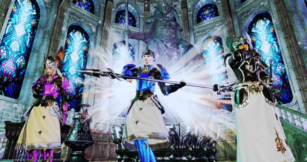
Destiney – Welcome back!! Last week I loved the simplicity of your shot. Great location, great choice, great glamour and pose. I wish you had tilted it just to add a bit of spice to the image, but other than that it was definitely a Destiney shot. This week you really went for it! I love that you had two friends help out and the outfits all match perfectly. Looking at the reference image, I get that you were lining them up like in the shot, but I think it would have been more interesting to have them standing closer to you, so you look like a team or close allies. Other than that, I love it. I think their poses match the characters, I think your wings look great. The blue on your chest centers my vision on you, and the background is very…angelic-church-medieval to me. Going into the finale I hope you can continue your simplicity is best photoshoot-style, but add just a bit of spice using tilts to score big! Good luck!!!
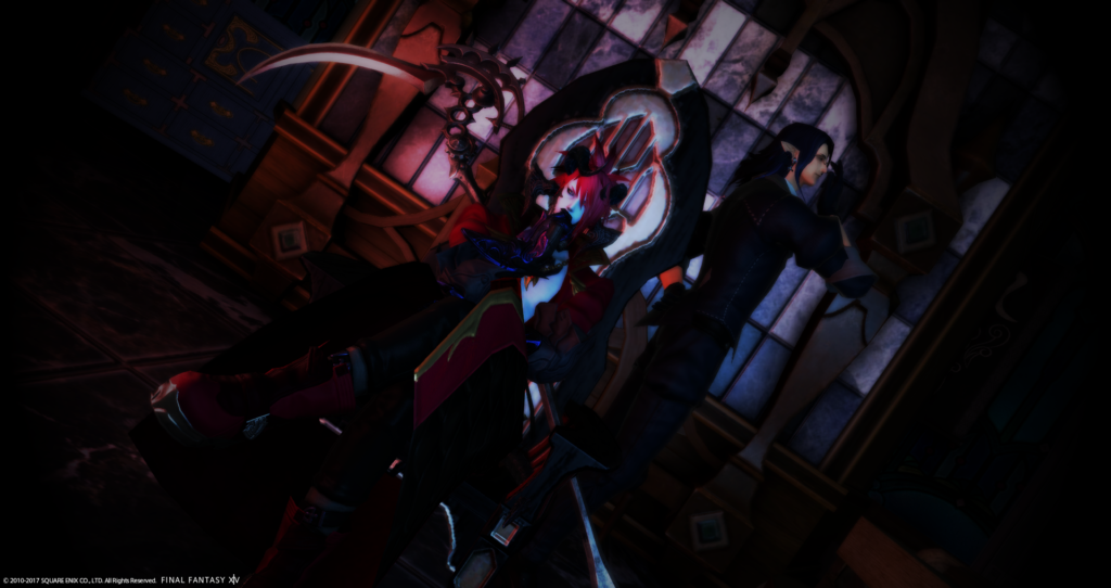
Leviathan – Hey bud! Welcome back! So, looking at your portfolio (all of your pictures) I can tell that battle shots are your specialty. Your scenic shots are always great, but I think you really enjoy the battle shots more. Last week was beautifully framed, and the background was great. The glamour was good in that it helped you stand out, but I would have removed the necklace. Your subtitle mentions being home, and yet you are looking at me, the viewer, instead of your homeland! This background is beautiful enough that risking a back shot would have been great and really worked at conveying a message! Your cosplay this week is probably your weakest shot of your portfolio. I like the background, the tilting, and the lighting on the tiles in the back, but its SO dark. I can tell your hair matches the reference picture, but everything else is really hard to make out. I also have no idea who the guy behind you is. You mention a butler, but also say that he is supposed to be an old man. I think the shot would have been stronger without him, and with more lighting. I think you have your legs crossed, and your knee pad is coving your face? But when I zoom in on JUST your face, I think you look really sexy and your face is awesome. Haha. Going into the finale I want you to impress me the way you have been before. Don’t let this shot be a dark (lol) spot on your resume! Good luck!!!
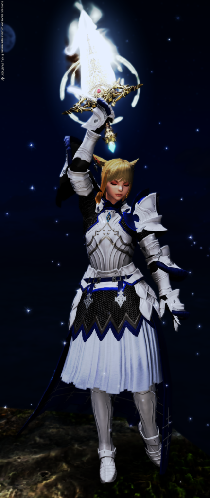
M’telihgo – Welcome to another round! Let me commend you on framing this perfect so that you are completely in frame from toe to tip of sword and ability. That, is really good. I think using the Limb Darkening and lighting features would have really brightened (LOL) up this shot. Looking at your reference shot, its full of light. Yours is just dark, especially on the bottom. I love the pose and the use of abilities though, and the background matches the reference shot perfectly. I’m not sure if this is what happened, but I feel like you equipped the Paladin’s AF and then looked for a character that matched that outfit, instead of choosing a character and then making the in-game gear work for you. Looking at Destiney’s, all her characters are also Paladin-type characters, but she dyed gear and really made it her own. Maybe you just like this character and lucked out that that gear matches so perfectly, but if you showed me this pic without the reference picture, I would think you were just a Paladin, and I think that defeats the purpose. I don’t think it’s a weak shot at all, and I know for the finale you will blow me away one last time like last week! I believe in you! Good luck!!!!
Katarh:
Gangly: This immediately brought to mind Aerith’s iconic scenes, so perfect location. Your costume makes you immediately recognizable. I love the drill curls. Dead in the center of a field of flowers is risky, but I feel like you pulled it off. Good usage of the vertical shot as well. Very nice!
Nicol: Great usage of the cinema frame to show off your movie star! The tilt is good since it adds some tension to her action pose. I love the costume, love the pose, love the mood, but the background is the one place I feel could have use just a tad more tweaking…. I can’t unsee that moogle mailbox. That is literally my only nitpick here. Great job!
Samuru: Great costume and a good selection choice for your character. The tilt adds to the drama of the scene you’re building. I like the background but I am unsure why the light is so bright coming from the window. It does make some cool long shadows at your feet, though! The one issue I have with this image is that you have distortion on your character due to the perspective shift. This can be tough to avoid and can be used to good effect in some scenes, but in this image, it is a minor flaw.
Zetsumei: Excellent Rydia! I love the usage of the bright red flower in her hair. “Wig” choice is perfect, and the costume is pretty much about as close as you can get since SE has not seen fit to give us a Rydia set yet. I feel that you sacrificed the background in order to get your pose – while your costume is great, and the pose is amazing, the background just isn’t there. That does detract from the overall composition, but you did still nail the Rydia mood 100%.
Linmei: I never played LoL and didn’t recognize your character (I thought you were a JoJo for a second there!), but I still love this image so much. Not only is the costume a nearly dead on match using otherwise wholly unrelated wardrobe bits, you have managed to create a totally zany mood in this image. This is one case where the deliberate character distortion absolutely works. I really can’t think of anything to improve this image. I think this is one of your strongest shots yet.
Destiney: I love the decision to bring in some extras to complete the squad. You also did an excellent job with all three of the costumes. The background is appropriate, but feels just a hair too… busy? And too bright. I thought the Hall of Valhalla scenes were a bit dimmer so I double checked. I think a less bright filter would have made this shot, something like the Echo or maybe even one of the sepia filters. (But then we’d lose that lovely color coordination, so maybe not.) Still, this is dead on for the mood and the costumes are amazing.
Leviathan: Another game I never played so I had to go look it up 🙂 I think you got the mood of this character just right. I love the usage of your horns and OMG THOSE BOOTS I NEED THEM (j/k.) The scythe is fantastic. I question the usage of the extra here…. since I never played the game, and he’s not in your reference image, I had to ignore him for the purposes of judging the composition, which means he doesn’t really add anything to the scene. The rest of the composition is great, however – a little dark but it has a lovely background, fun camera tilt, and some interesting lighting effects.
M’telhigo: I had to let out a little bit of a gasp here because your Saber is so lovely. You’ve gotten very close to her outfit, considering we’re still missing a lot of pieces that would go into the costume, but more importantly you nailed her mood here. Excalibur high in the sky! The vertical shot gives you a maximum view of the costume, and I love the particle effect mimicking her magic from the reference image. I think my favorite thing is the little hint of the moon in the very corner. Great job!
Nadede:
Gangly Zilla: Gangly this is a very lovely shot from you this week. It is so serene. I also promise to try not to fall through the church roof onto your flower garden. As I’m looking at your shot this week, I can’t help but start playing Aerith’s theme in my head (one of my fav’s by Uematsu). I like the fact that you decided to take this week’s shot amongst the flowers, almost reminiscent of the first time one meets Aerith in FFVII, and the pose that you used is one that I almost always see in pictures. Your glamour is for the most part pretty spot-on. I do like the lighting in the picture and the fact that it appears you used a vignette to help draw the audience’s eye to you. I don’t think I can really find anything wrong at all this week. I cannot wait to see what you come up with next week. Keep it up!
Nicol Grunenberg: Nicol I do have to say that you have been improving the last week or so! Keep up the good work. Your glamour is spot-on with the persona you chose to exemplify. I also like how in your pose you can just get a glimpse of your eyes staring at the audience as if telling us “Come get me, if you dare.” It would have been rather interesting if you were able to gather up some friends to replicate the reference image (more the merrier sometimes). The tilt of the screen also helps your shot give a more dynamic feel to it. I would like to encourage you to keep in mind of what is within your surroundings when you take your shots. I say that because the moogle mailbox takes away from the feel of the shot, granted it does have me wondering if Terantino would put something that odd/cutesy in a frame. I do admit I’m not a big Terantino fan (gasp) but I do give him props for how he does his films and I think you did him some justice with your shot. Keep up the good work and can’t wait to see how you fair with next week’s shot!
Samuru Lantis: Samuru, I must say, well done! This is something I’ve been waiting to see from you. It appears you might have been listening to feedback and putting them to good use. Yours is another one that I see and can’t help but start playing certain music in my head, like Symphony Fantastique or Night on Bald Mountain or anything along those lines (what can I say, I like my classical music lol). I love how the light hits you from behind and casts a shadow onto the floor and extends beyond the edge of the shot. You have the right tilt that actually works with your image and helps give your pose some movement and makes it appear as if you just pulled your sword out. Your overall shot also has the feel of artwork that I’ve seen surrounding Castlevania. Your glamour is spot on as well. Keep up the good work, keep taking from the critiques and can’t wait to see what you pull out of your sleeve next week,
Zetsumei Tsunarashi: Zetsumei, for the most part another lovely shot from you this week. Your cosplay is pretty much spot-on, just like a lot of the other models. I like how you are practically the dividing line between the bright sky and the dark ground. It also looks like you might have played around with the limb darkening to help draw the audience in to where you are at. Your eyes are another thing I’m liking as well as you are seducing whoever is off screen and telling them (with your eyes) to go to you. How your eyes are facing and how your body is posed, it works perfectly. While I do like the shot itself, there are just a few things that do throw it off some. What is throwing me off for this shot is how the skirt is sticking up (I know there is nothing anyone can do there) and biggest thing throwing me off is your back leg appears to be going through the object you’re lying on. I also wished you could have used a reference image of the actual character instead of someone else’s cosplay of the same person. So far you haven’t disappointed me yet and can’t wait to see how you do next week.
Linmei Quan: Remind me not to do anything to tick you off Linmei. I’d hate to see what would become of me if there was a use of force :S . Your glamour is spot-on to a t. I do like the lighting that you have going on in your image. Along with the depth of field gives you almost a soften look. I also like how the blues in your image goes well against the reds/pinks. It helps make things within pop out. What I do find off setting in your image this week is the severe tilt you are using. It just feels very awkward and appears that you chose that angle to get your whole body into the shot. I also wonder what the shot would look like with how you are posed but your eyes were looking towards the audience somehow (if it is possible to do). Don’t get me wrong, the image does show your personality and you seemed to have picked a toon that works well for you. It is just that tilt that I am not caring much for. I encourage you to try to blow me out of the water next week as well as stepping out of your comfort zone. Good luck and can’t wait to see what you come up with next.
Destiney Delvanguard: Ah, Odin’s main girls, the Valkeries. Another image that has me playing Ride of the Valkeries in my head. It is so refreshing to be able to see your face fairly well this week. I do like the statue that you have in the background and feeling like you and your companions have just finished praying before going off to join Odin’s side. You and your companion’s glamour is pretty spot on with your reference. While I do like what is going on with your image, I can’t help but feel that maybe another colored filter would have worked better. The colored marker filter makes you look a little washed out, especially next to the color of the wings. Keep playing around with filters as some will enhance your image while others take away from it. Keep on reading and taking from feedback given. Can’t wait to see how you fare next week.
Leviathan Seagreen: Leviathan, you have been one of my favorites so far in this competition but I feel that you might’ve taken a step back this week. While it appears that your glamour is spot-on with the character that you’ve chosen, your image is a lil bit too dark for me to tell. I do like the lighting you have going on, I just wish that you could have added in just a little more light to your image to help make you pop out some more. It appears that you do like the dark backgrounds so I encourage you to play around with the lighting some more to help make you pop out some more. Would love to see you back towards the top for me this next coming week so good luck and looking forward to what you come up with.
M’telihgo Feilyon: This is a very nice shot that you did this week M’telihgo. Unlike most uses of the colored marker filter I’ve seen, so far it has worked nicely for this shot. I also like how you have a light colored glamour on (which fits your reference image perfectly I might add) against a dark background. It helps make you stand out even more. I do wonder how it would have turned out if you used a light vignette, but then again, you don’t really need it at all. I can’t really find nothing much wrong with your image at all. I can’t wait to see what you come up with next week.
